I used my stop motion model to attempt a short stop motion animation of my character moving across the screen.
I found this extremely difficult as my character was too heavy to support itself as I moved it. In future I would use less modelling clay or build a more supportive frame. This problem also could’ve been solved with the use of a rig.
The objective for this unit was to create an animation based off of the theme “Escape”. As animation was already a main skill of mine and something I want to go into in the future I feel as though I put a lot of effort into this project- but I also realise that this was my downfall as I got too ambitious- I wanted to create something that I didn’t realistically have the time to create.
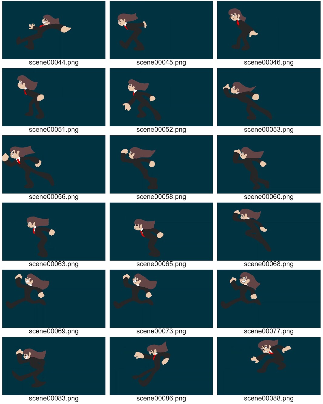
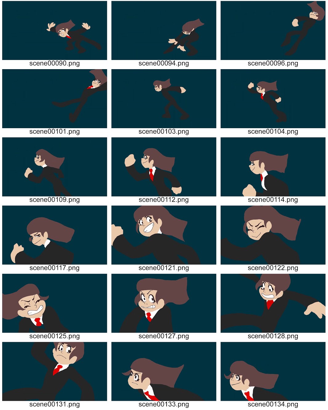
I decided that I wanted to try out a different style of animation, so for my research I looked at what styles and techniques I liked the best. The look of my animation was heavily inspired by early 2000s Western animation- with the simple designs and fluid, exaggerated movements and expressions. The colouring style happened due to a technical incident however it is reminiscent of Mewtripleds animation “Endlessly”.
After my research I designed a character and created a storyboard. The challenge here for me was creating something with a ‘U’ rating. I feel like the original concept (Shown in folder) for the characters and story was more interesting but I scrapped it as I felt unsure if it was suitable for the target audience. My character has a basic design that I knew would be fairly easy to animate consistently and on-model.
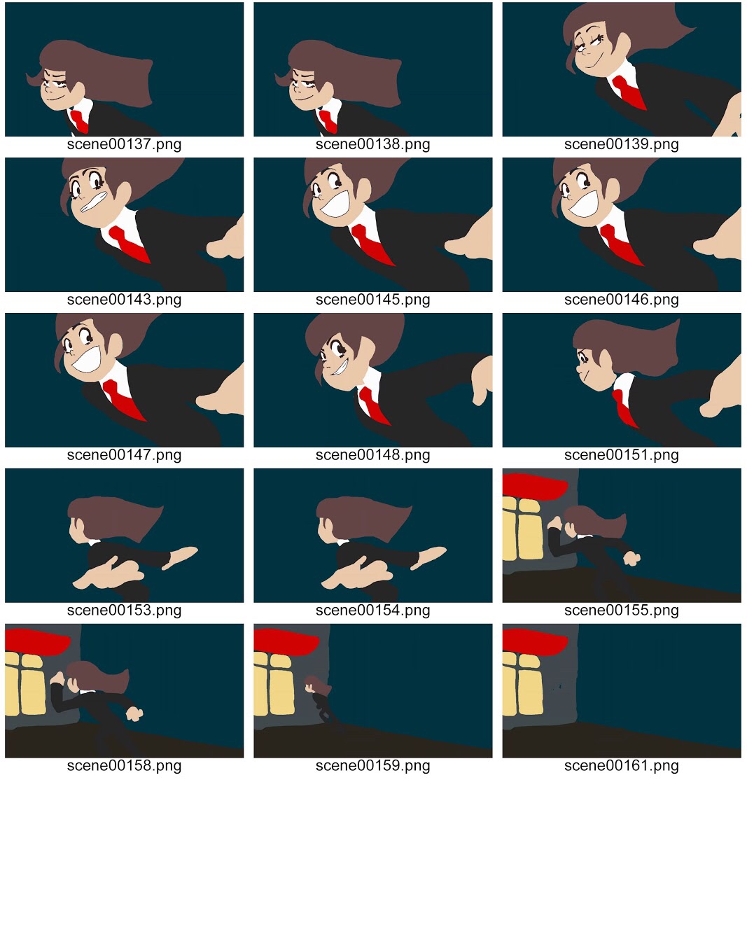
Following my storyboard I used my Wacom tablet and TVPaint Animation 10 to create a 10 second long, fully coloured, 2D, digital animation about a girl performing a solo heist- it opens with her jumping through the window and then shows her running as she makes her escape and flees into another building. I’m proud of the fluidity, quality of the motion and the fact I managed to colour the whole thing- but my main issue is that the actual escape itself isn’t self explanatory- if I had the time I could’ve had her holding a gem or a money bag and I could have shown an officer chasing her as she ran.
Unfortunately since the movement in my animation was so complex I had reached deadline week by the time the frames I had already drawn were finalised and coloured, so adding more was an unrealistic goal. I realise I should have simplified my character’s movements.
Overall, I’m happy with what I created but I feel as though I could have done more had I thought out a more realistic schedule and thought more about how ambitious I could actually be within the timeframe given. I think a lot of time I could’ve spent on this early on was spent worrying over the concept that I scrapped. I should’ve thought more carefully about what I wanted to go through with. I don’t think I’ll carry this character/story into a new project but I would like to revisit my original idea, “Hellscape” at another time.
Colouring the animation took a lot longer than I expected it to. I initially wanted to add white outlines to show lines in her clothing etc however wouldn’t have the time to do so.
I’m proud of the outcome but there are some aspects that I would improve if I had time- the building she enters at the end feels rushed and I am aware there are a few frames where the colouring is not as clean as it could have been.
Due to a technical issue in which I lost all of the lineart for my animation and had to screenshot the frames from an earlier version from Youtube I had to use a no-lineart colouring technique. I found this time consuming and difficult although it has helped me find a style of colouring that I really enjoy working with.
Now that the animation itself is complete I hope to add sound that synchronises with her movement.
Timeline as of now:
I used three separate layers, the bottom-most had my lineart on it, the top has the main colouring on it, and the middle layer is the background for the running sequence. My animation runs at 12FPS- half of the standard frame rate.
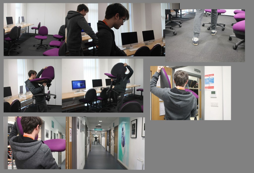
This is my final composition for the graphic novel project- I explored time based issues by figuring out how to convey an action and movement by using photographs. Our photographs show a narrative and a sequential series of images that show a story.
The majority of my research for this task was on Pinterest- I looked at different picture stories and graphic novel pages and picked up certain techniques from them. The cropped detail images are inspired by tense scenes shown in many graphic novels. I also used my research to figure out what layout was easiest for me to understand, I settled on a linear right to left layout.
I like the final piece that I’ve created because it’s simple yet effective. It gets the point across with minimal editing and effects. After experimenting with different layouts I figured that this is what I liked the best. I also like that the cropped detail images help focus on what’s happening as well as remove the background clutter.
I could have improved this by using more effects to make it more interesting to look at. I considered turning it into a manga spread using the traditional Japanese left to right format and putting it into black and white however I figured this may be very complicated and hard for people who don’t know how manga is laid out to understand. I also think that some of the images at the top are very dark- I should have lightened these.
Here I used the lens flare and lighting effects tool to create a spotlight on the focus of each panel. I find this helped fix the lighting in a lot of the images and created a more dramatic effect.
Photoshop tools that are useful in digital manipulation include:
Selections
Selections allow you to select certain parts of an image. You can use this to cut out parts of images or to apply a filter/effect to a specific part of an image.
Adjustments/filters
Adjustments are how you can change the brightness, exposure, colour balance etc.
Filters are pre-made tools that allow you to add effects and stylisation to your images.
Layer/Blending modes
Blend modes are used to alter how two layers interact with eachother. There are 19+ modes.
Drawing tools
The drawing tools are simply used to draw over an image- you can use a free-hand brush tool or you can use shapes e.g squares, circles, rectangles etc.
I made several research boards on Pinterest. These helped me look at compositions, already existing graphic novels, and images with a narrative or a story behind them.
This research helped me better understand storytelling and the effects you can achieve using different colours/layouts etc
The composition/storyboarding board was the most useful to me as I find working with compositions and laying out images difficult.
With the first composition I experimented with shapes and overlaying panels. I think that this was hard to get right on the page because of the size difference in the panels.
I like the split panel that shows the 2 detail shots, I think this helps focus on the details in the image better, but I don’t like the empty space at the bottom of the page.
The second composition has all of the images laid out in a simple grid. It makes the story simpler to understand but I don’t like this composition as it gives all of the images the same weight and effect, when some are more important and some are less important.
The third composition keeps the images the same size but has them overlaying eachother. I find this strange to look at and hard to follow, but it was worth experimenting with.
Rabbit and Deer makes use of both 3D stop motion and 2D traditional animation, sometimes simultaneously. The animation is about the bond between a rabbit and a deer- they live in 2D until the deer becomes fascinated by 3D. Eventually the deer becomes 3D and has to figure
The characters make noises rather than speaking, and there is a lot of use of music and sound effects. The noises are emotive and it’s easy to tell what the character is feeling without them having to say anything.
Another technique the animator has used was white lines on a black background- this was used to convey darkness in the room. I think the fact that everything is black creates a lonely feeling- especially when the deer is still awake and the rabbit is asleep.